Tekkers2: A Bold Display Font for Digital Impact
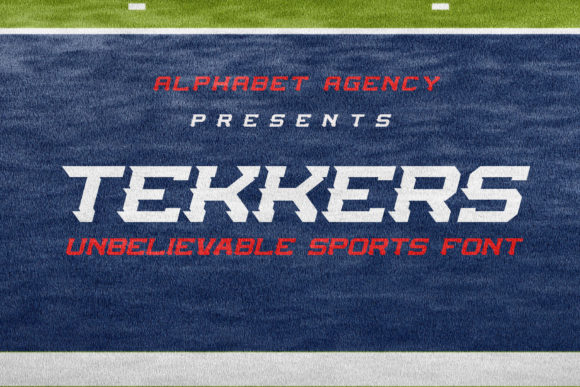
As a UI designer who ships landing pages, SaaS dashboards, and e-commerce experiences weekly, I treat typography like interface logic — every font choice must serve function, hierarchy, and brand clarity. Tekkers2 isn’t just another display font; it’s a purpose-built typographic accelerator. With its sharp angles, dynamic rhythm, and sporty energy, Tekkers2 delivers visual velocity without sacrificing legibility in digital contexts.
Visually, Tekkers2 leans into confident geometry: tight letter spacing, high x-height, and subtly tapered terminals that give motion even at rest. It’s not a script or handwritten font — it’s engineered for screen presence. The uppercase-heavy character set thrives in short-form applications: hero headlines, CTA buttons, section dividers, and product name badges. Its personality reads as energetic yet professional — ideal for fitness apps, creative studios, youth-focused brands, or any digital product where momentum and clarity matter.
Where Tekkers2 Earns Its Place in Your Layout
In real-world web design, Tekkers2 performs strongest where attention must be captured fast and held with intention. On a product landing page, using Tekkers2 for the primary headline (e.g., “Launch Faster”) instantly signals speed and capability — reinforcing messaging before the first sentence is read. For online stores selling athletic gear or streetwear, Tekkers2 on category banners (“New Drops”, “Limited Edition”) adds urgency and authenticity without needing extra iconography.
It also excels in constrained spaces: mobile navigation bars, app onboarding screens, and email header graphics. Because of its generous counters and open apertures, Tekkers2 remains scannable even at 24px on a 375px viewport — especially when paired with sufficient contrast (e.g., white text on deep navy or charcoal). Avoid using it below 18px for body or caption text; this is a display font, not a workhorse sans serif.
Building Hierarchy Without Sacrificing Tone
Visual hierarchy isn’t just about size — it’s about contrast in weight, shape, and personality. Tekkers2 creates immediate distinction against neutral companions. Pair it with a clean, highly legible sans serif like Inter, Manrope, or even system fonts (SF Pro, Segoe UI) for paragraphs and form labels. That contrast does two things: it guides the eye naturally from headline to action, and it reinforces brand tone — bold but grounded, expressive but trustworthy.
For editorial or portfolio sites, consider pairing Tekkers2 with a restrained serif (e.g., Literata or Lora) for bylines or pull quotes. The juxtaposition adds sophistication while keeping Tekkers2’s energy contained to strategic moments — like project titles or exhibition headers. Never pair Tekkers2 with another decorative or condensed display font; visual competition dilutes impact.
Responsive Behavior & Practical Readability Notes
Tekkers2 scales cleanly across breakpoints — no pixelation or awkward kerning shifts — especially when served as WOFF2 via modern @font-face declarations. On dark mode interfaces, ensure your CSS defines fallback contrast ratios: aim for at least 4.5:1 against background colors. Test overlays directly on hero images; Tekkers2 holds up well over mid-tone gradients or desaturated photos, particularly with subtle text shadows or semi-transparent background bars.
On buttons, use Tekkers2 sparingly and intentionally: best reserved for primary CTAs in hero sections or feature cards (e.g., “Get Started”, “Join Now”). Avoid applying it to secondary actions or filter chips — those need neutrality and predictability. Also skip it for error states or tooltips; clarity trumps flair in functional microcopy.
Licensing, Formats, and Real-World Deployment
Tekkers2 ships as a premium font with full webfont support — including WOFF, WOFF2, and variable options if available. Check the package for OpenType features like stylistic alternates or discretionary ligatures; these can add polish to logo lockups or branded social assets. Multilingual support covers Latin-based languages (including accented characters for French, Spanish, German), making it viable for global-facing SaaS dashboards or international e-commerce banners.
Licensing matters: verify whether your license permits use on live websites, client projects, digital templates (e.g., Figma UI kits), or embedded web apps. Most commercial font licenses cover standard web embedding via CSS @import or self-hosting, but exclude redistribution in editable design files sold on marketplaces unless explicitly extended. If you’re building a white-labeled product or theme marketplace, confirm extended licensing terms upfront.
When to Reach for Tekkers2 — and When Not To
Reach for Tekkers2 when you need:
- A hero headline that communicates motion, innovation, or competitive edge
- Branded section headers on a coaching site (“Your Breakthrough Starts Here”)
- Product name treatment in an online store or digital catalog
- Animated text reveals in Lottie or GSAP-driven interactions
- Logo wordmarks where custom lettering isn’t feasible
Avoid Tekkers2 for:
- Long paragraphs, pricing tables, or data-dense dashboards
- Form inputs, labels, or accessibility-critical UI elements
- Legal footers, copyright lines, or small-print disclaimers
- Any context requiring strict WCAG AA/AAA compliance for body copy
In practice, Tekkers2 works hardest when used with restraint. One strong application per screen — often just the main headline — builds recognition and rhythm. Overuse flattens its impact and undermines the very hierarchy it’s meant to create. Think of it like a well-placed accent color: essential in moderation, overwhelming in excess.
Whether you're refining a course sales page, launching a creative agency site, or designing a boutique skincare brand’s Shopify theme, Tekkers2 offers more than aesthetic flair — it delivers tonal precision. It says something specific, quickly, and memorably. And in digital design, where seconds define engagement, that specificity isn’t decorative. It’s functional.